tulip fest
Amsterdam's Tulip Festival | Rebranding
Amsterdam’s Tulip Festival is a vibrant symbol of Dutch culture, yet its existing identity lacks the energy and visibility that the celebration deserves. This redesign draws from the city’s spirit of freedom, inclusivity and creative expression, bringing forward a bold, youthful visual language that mirrors the explosion of colour that fills the streets each spring. The refreshed identity invites both locals and visitors to experience Amsterdam in bloom, transforming the festival into a lively, contemporary celebration.


Sunrise Orange
#F27127
RGB: (242,113,39)
CMYK: (0,53,84,5)
colour palette
The selected colour palette is designed to reflect the vibrancy and the authentic colourful spirit of spring in Amsterdam. Each colour ties back to the themes of bloom and freshness.
Bloom Red is the main colour with it capturing the core tulip imagery, while Sunrise Orange is used as an accent colour that adds excitement to balance the red for a strong visual impact. Sunrise Orange also draws back to the cultural importance in the Netherlands. It is tied to the Dutch royal family to symbolize national pride, celebration, and unity in the festival.
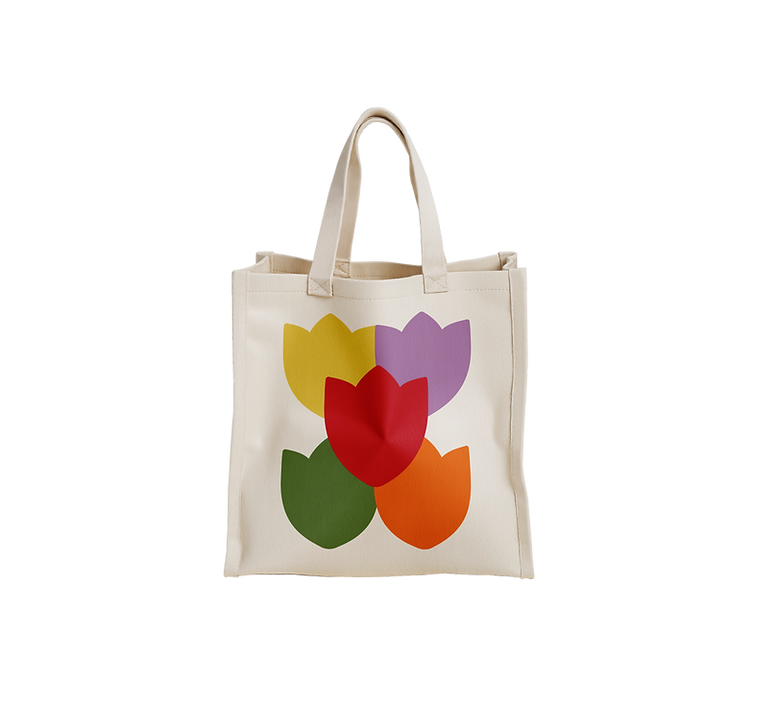
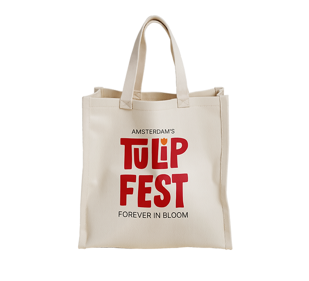
Throughout the rebranding, these colours were carefully utilized through the different logo adaptations, a wayfinding icon system, and promotional pieces as well as souvenirs that visitors can take with them and remember their visit.
Bloom Red
#D92B4B
RGB: (217,43,75)
CMYK: (0,80,65,15)
Blossom Yellow
#EFD462
RGB: (239,212,98)
CMYK: (0,11,59,6)
Sprout Green
#708C5D
RGB: (112,140,93)
CMYK: (20,0,34,45)
Canal Blue
#5A9ECC
RGB: (90,158,204)
CMYK: (56,23,0,20)
Petal Purple
#B48ABF
RGB: (180,138,191)
CMYK: (6,28,0,25)


At a festival that celebrates color, creativity, and inclusivity, the wayfinding system is designed to be both intuitive and joyful, the system uses color-coded signs, playful iconography, and conceptual naming to facilitate your way around. With visitors coming from diverse backgrounds and age groups, clarity is key.


