top of page
fv LOGO.png
hyhyasdas.png

glow force

swoosh.png

Skin Care Line | Packaging Design & Branding 

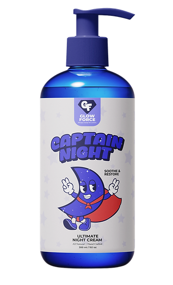
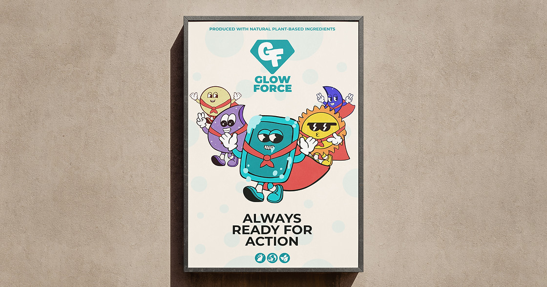
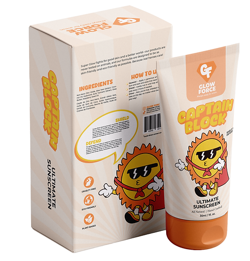
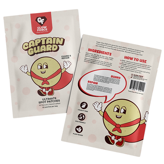
Glow Force is a West Vancouver based skincare that required branding and packaging preteens. With skincare there is a lack of engaging, age appropriate products that encourages healthy habits early on. Glow Force is empowering, fun, effortless, effective, and a part of an everyday routine. The design solution creates a fun experience through retro doodle superhero characters representing each product. Inspired by mid-century comic art, the style adds nostalgia, energy, and personality, making skincare approachable and exciting. The characters aims to resonate with young users and their environmentally conscious parents alike. 

tgasd.png

The logo has been created based and inspired by the traditional superhero emblem and shape of a diamond. In the middle of the diamond, it features the initials of the brand name GF. The icon represents and symbolizes Glow Force as a whole, with a playful font and placement to unify as a symbol for the group of heroes.

Glow Force represents a fun, empowering, and action-packed approach to skincare for pre-teens. Glow symbolizes healthy & radiant skin and feeling both positive and confident about how you look. Force brings in the superheroe theme as a squad of characters work together to protect, defend and enhance the skin.
cfcfcf.png
cgcg.png
cgcg.png
Poster_Frame_Mockup_2 322.jpg
bottom of page